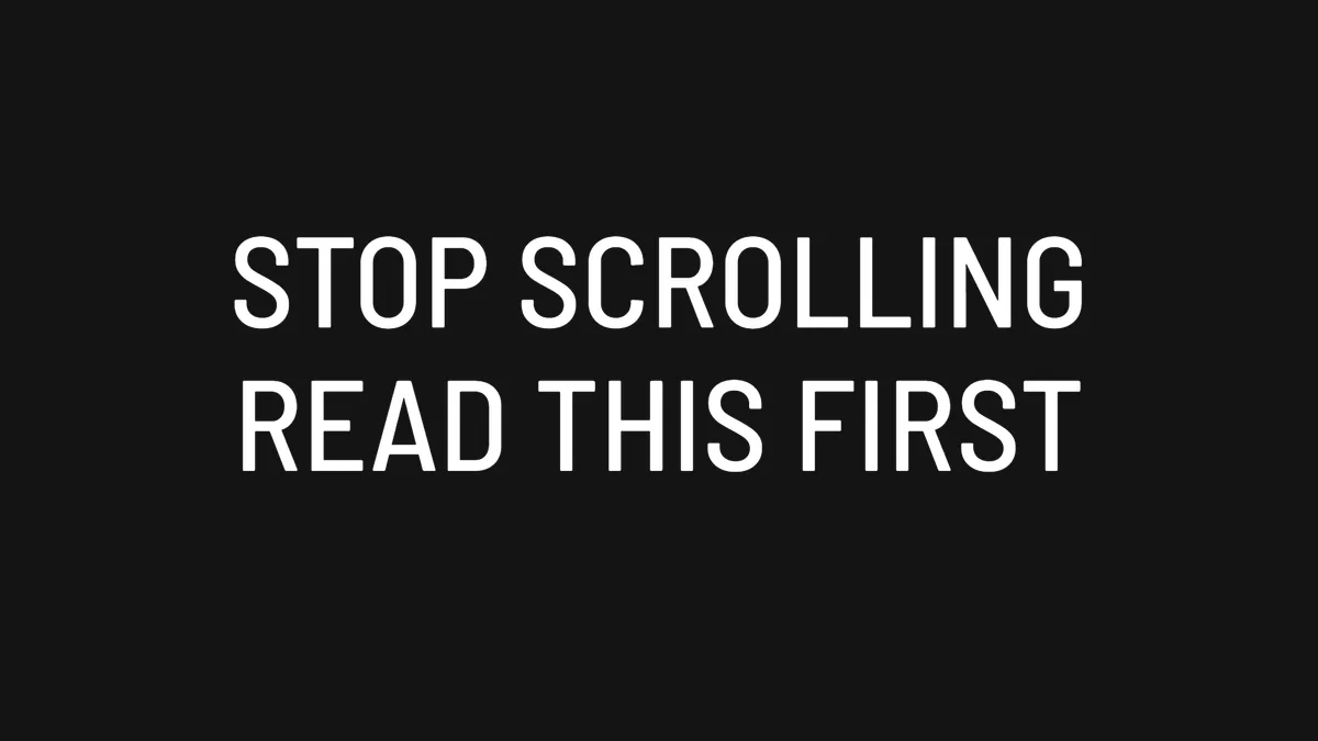
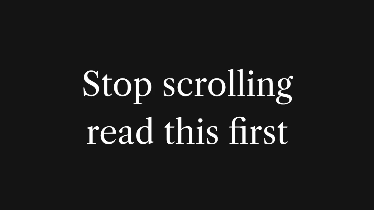
Tap the Aa button in the Instagram Reels or Stories text editor and you get fourteen styles. Instagram never tells you what fonts they are, and none of them can be downloaded. This page shows what each one looks like, what it really is, and the closest free font so you can rebuild the look on a computer.
Every example below was rendered with the Instagram Title Card Maker, which reproduces the spacing, pill shape and font of each style. Measurements come from screenshots of the app, not guesswork.
Quick answer
What font does Instagram use for Reels text? The default Classic style is Instagram Sans, a typeface Meta commissioned for its apps. It is not available to download. Inter Extra Bold is the closest free match and looks identical at Reel sizes.
The 14 styles
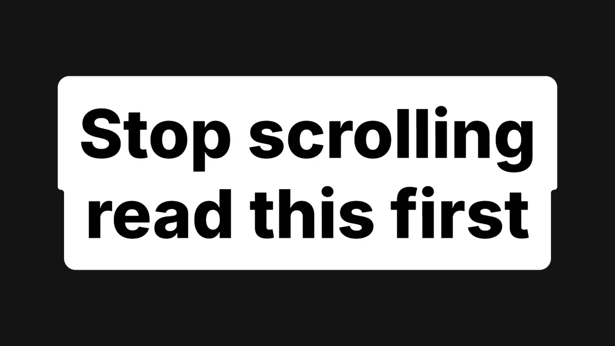
Classic Instagram Sans · the default
Closest free font: Inter Extra Bold
Also close: Poppins Extra Bold, Montserrat Extra Bold, Roboto Black
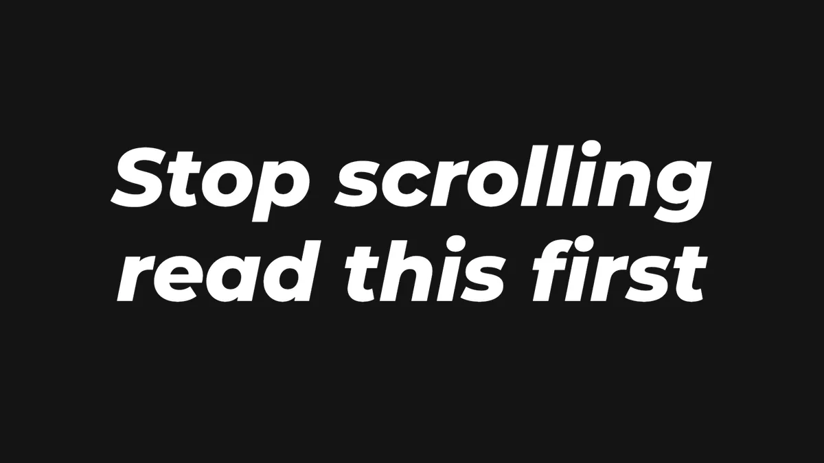
The one everybody recognises. A bold, neutral sans with a white background behind each line, stacked into stepped pills. This is the hook style on most viral Reels. Instagram Sans is based on the same proportions as Inter, which is why Inter matches so closely.
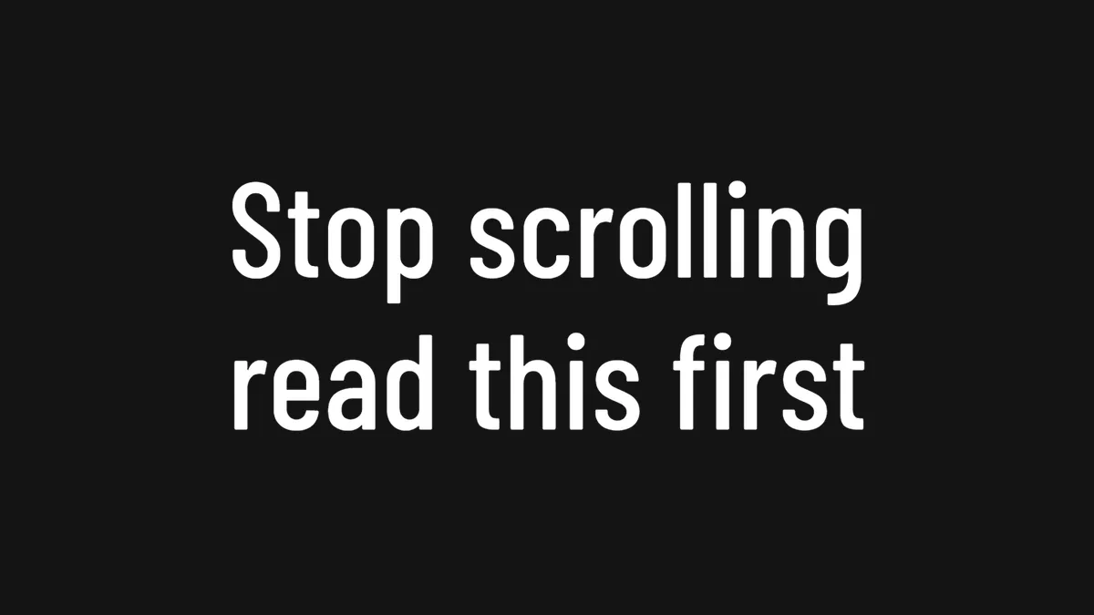
Tall, narrow letters with even strokes and tight line spacing. Fits a lot of words in a small space, which makes it popular for fashion, fitness and product Reels where the text sits over the footage.
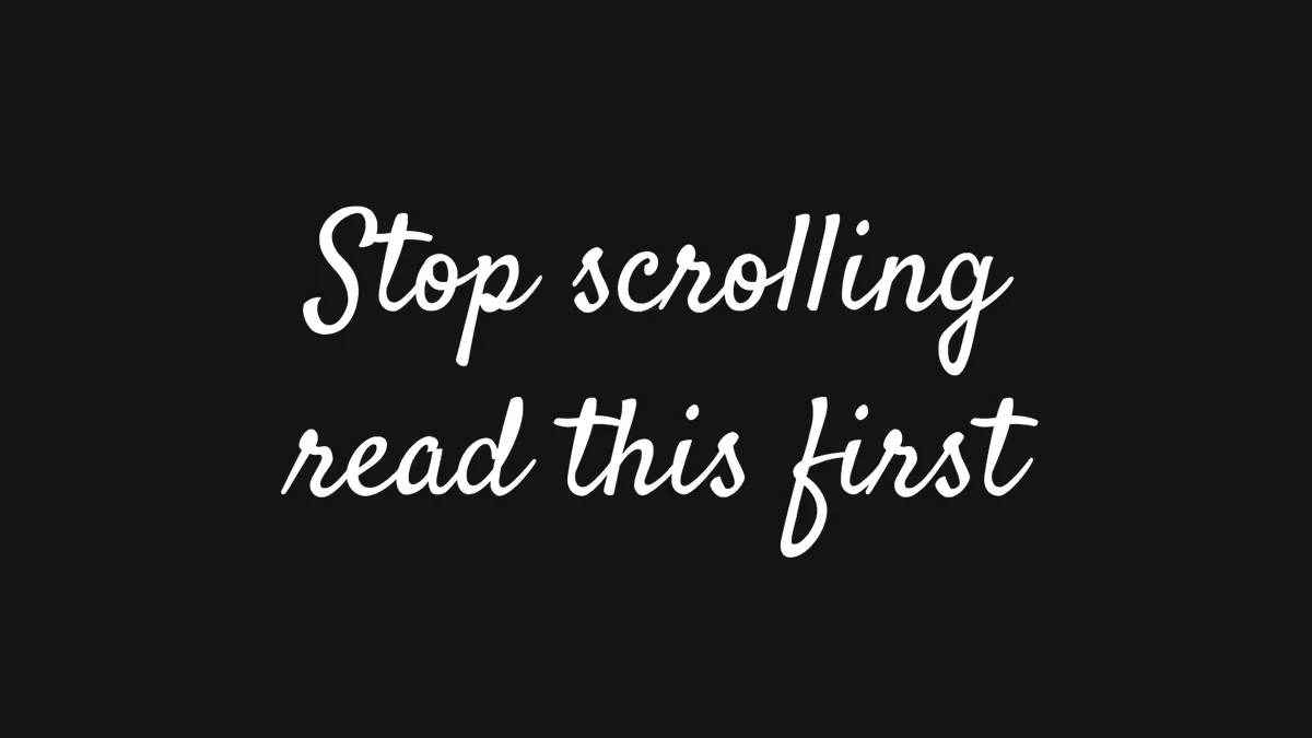
Also close: La Belle Aurore (thinner), Dawning of a New Day
A connected handwriting script, the kind used for a name, a date or a single soft word over a photo. Instagram's version is slightly thinner than any free script, so Satisfy is the nearest match rather than a perfect one.
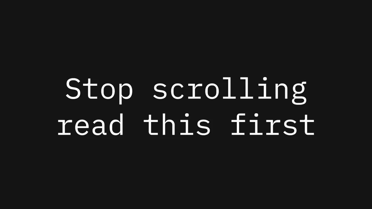
A clean, modern monospace, like a code editor rather than a typewriter. With the background on, Editor draws one rectangle around the whole block instead of a pill per line. Good for captions that should feel technical or documentary.
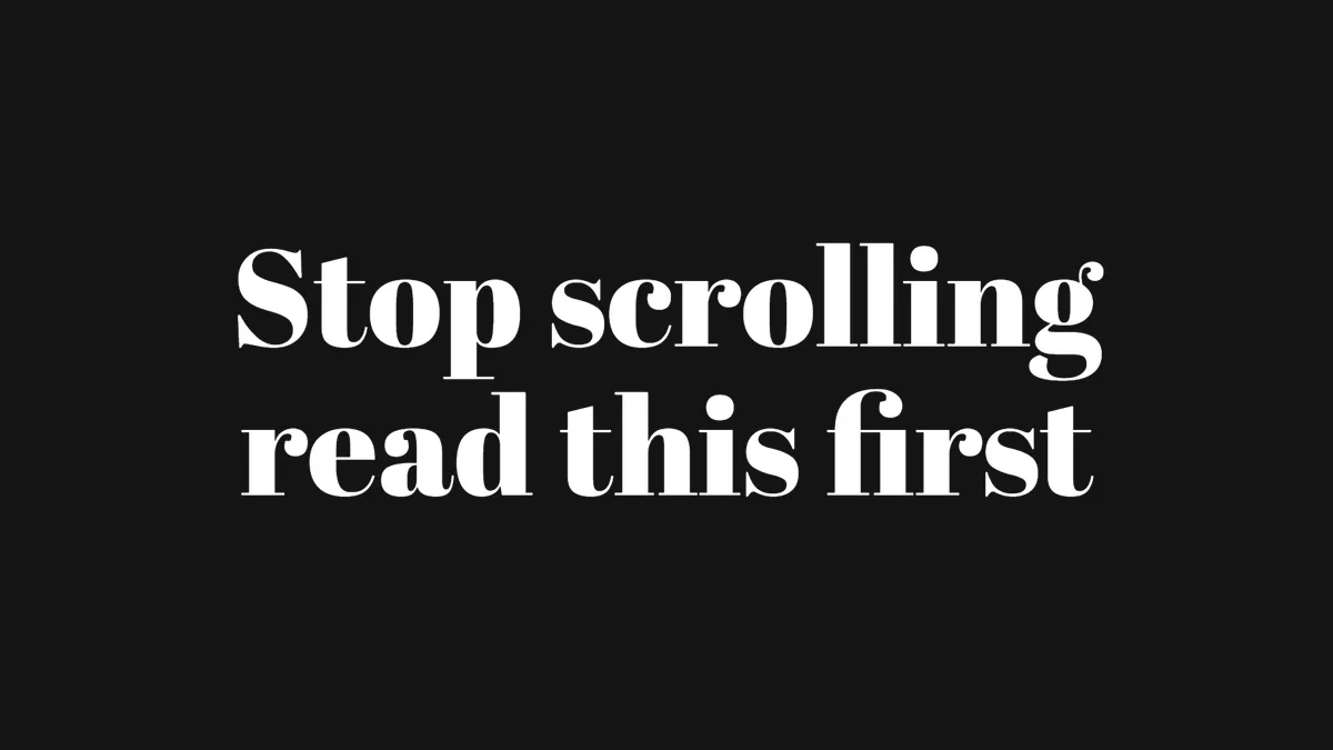
A heavy display serif with thick verticals and hairline thins, straight out of old theatre posters. Very tight line spacing. Works for one or two big words, not paragraphs.
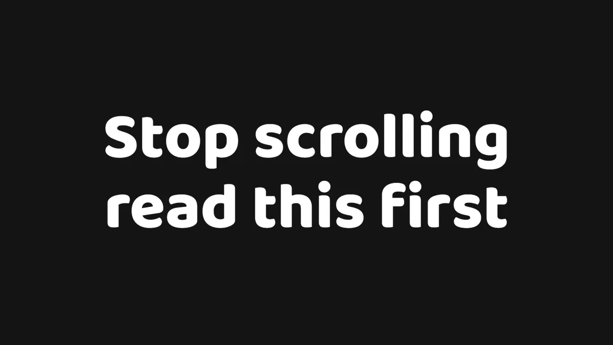
Chunky, rounded letterforms with a big corner radius on the background. Friendly and playful, so it shows up on food, kids and comedy content. The background pills are much rounder than Classic.
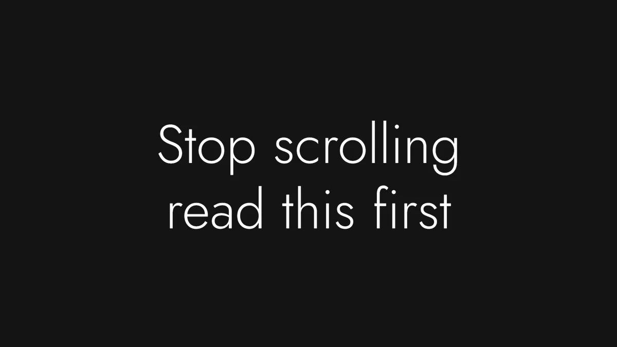
Thin, wide, geometric letters in the 1920s Art Deco spirit, with a generous single block behind the text when the background is on. Reads as premium and calm. Keep it large, as thin strokes disappear at small sizes.
Also close: Oswald Bold, Bebas Neue (capitals only)
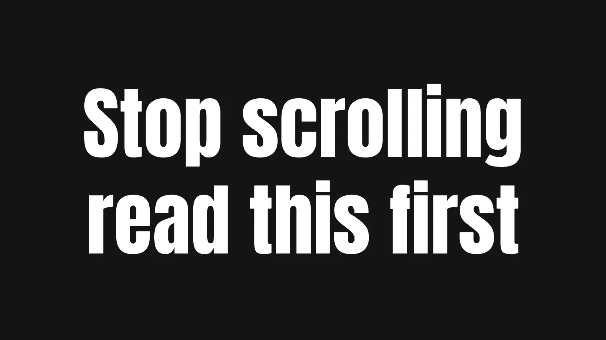
Very tall and very tight, the classic "impact" look for sports, news and reaction Reels. The lines sit flush against each other with almost no vertical padding, so a three-line Squeeze card reads as one solid block.
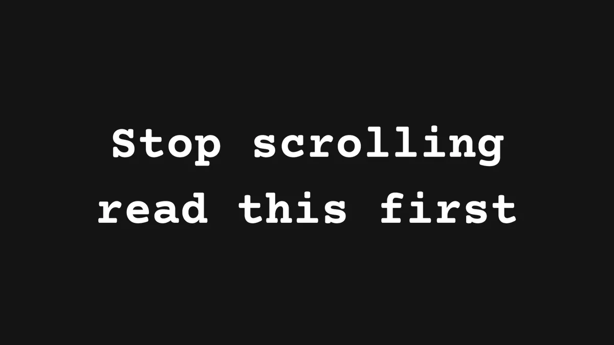
The typewriter look, with wide line spacing and a single rectangular background. Used for storytelling, journaling and "day in the life" captions. Courier Prime is the free font closest to Instagram's weight and letter width.
Also close: Montserrat Black Italic, Poppins Extra Bold Italic
Classic's louder sibling: a heavy geometric sans, slanted, with slightly tighter lines. Made for punchy one-liners and callouts. The italic is what separates it from Classic at a glance.
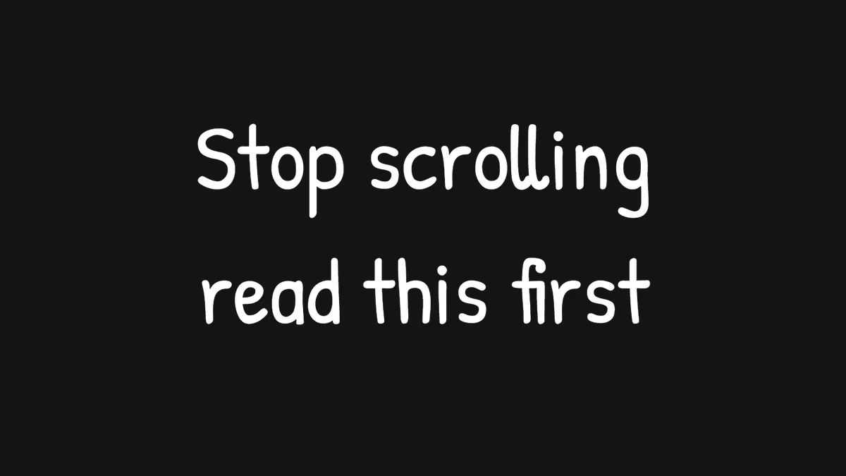
A casual marker-pen hand with loose, wide line spacing. Deliberately unpolished, which is the point for meme captions and self-aware commentary. Pairs with the translucent background for a sticker feel.
Also close: Bodoni Moda Italic, Cormorant Garamond Italic
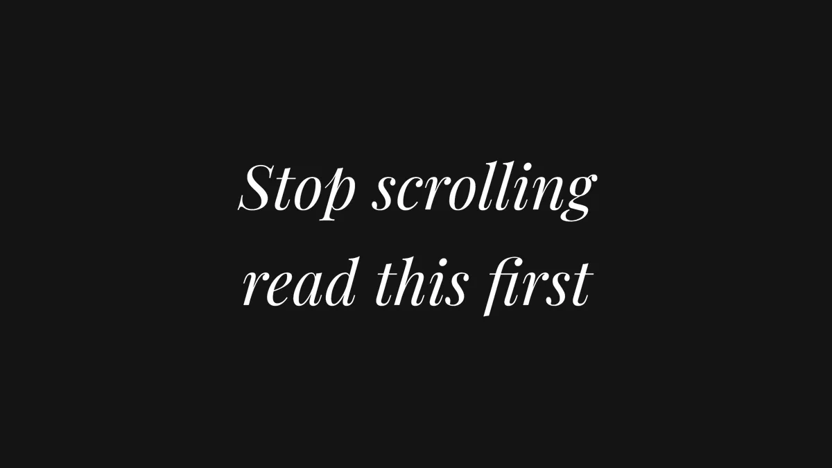
A refined italic serif with the widest line spacing of all the styles, so a quote breathes. Wedding, beauty, interiors and quote Reels. The background is one wide block with square corners.
Also close: Barlow Medium, Roboto Condensed Medium
Always uppercase, medium weight, with a very wide, fully rounded background like a road sign or a button. Instagram uses it for labels and locations. It is the only style that forces capitals.
A readable book serif, upright and traditional, with roomy line spacing and a single block background. For longer passages, poetry and anything that should feel like a printed page.
Open the maker and choose the same style you would tap in the app. Fonts, spacing and pill shape are set for you, measured from Instagram screenshots.
Type and adjust
Enter starts a new pill, just like the app. Turn the background on or off, change colours, add emoji. Everything is drawn in your browser, nothing is uploaded.
Download the PNG
Export a transparent PNG at 3× and drop it on the layer above your video in CapCut, Premiere Pro, DaVinci Resolve or the Instagram editor itself.
Questions
What font does Instagram use for Reels text?
The default Classic style is set in Instagram Sans, a typeface Meta commissioned for its own apps in 2022. It is not sold or distributed. Inter Extra Bold is the closest free font: the letter widths and weight match almost exactly, which is why the maker uses it as the default.
Can I download the Instagram fonts?
No. Instagram Sans and the typefaces behind the other thirteen styles are licensed to Meta. Every style does have a free Google Font that matches closely, listed above, and all of them are released under the SIL Open Font License, so you can use them freely.
Which style makes the white title cards on Reels?
Classic with the background switched on. In the Instagram text editor, tap the A button above the keyboard to cycle the background: none, solid, then translucent. Bold black text on white stepped pills is the most used hook on Reels, and the maker reproduces the exact pill geometry.
Why do the pills step in and out?
Instagram draws a separate rounded box for every line, sized to that line, and merges the boxes where they overlap. A short line under a long one gets a narrower pill, which is the stepped look. The maker uses the same rule, including the extra height on the wider line.
Are the matching fonts free for client work?
Yes. All of the recommended fonts come from Google Fonts under the SIL Open Font License, which allows commercial use, including videos and cards made for clients.
Does this work for TikTok and YouTube Shorts?
Yes. The PNG is transparent and sized for 1080 × 1920, so it drops onto any vertical video. Only the font styles are Instagram's; the workflow is the same everywhere.
Make your title card
All fourteen styles, free, no account, transparent PNG export. Works on desktop and phone.